
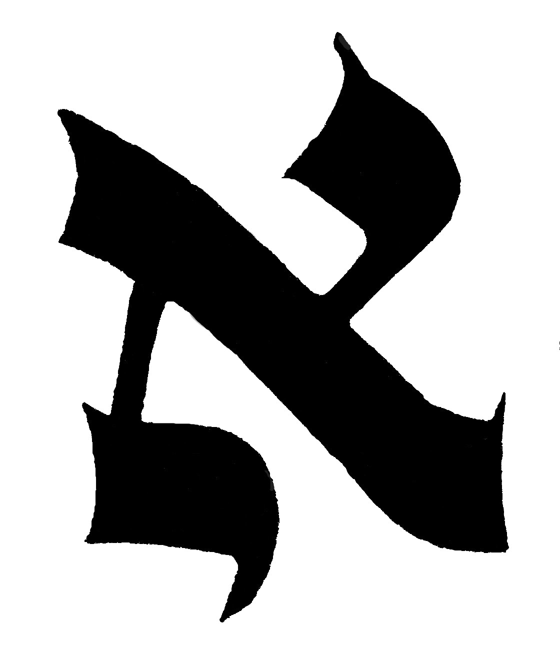
The letter ALEPH
1. The upper point is like a letter yud. 2. And there should be a small okets (protrusion) on it. 3. And its face along with the okets should be inverted a little to face upwards. 4. And the thigh of the yud should join to the [slanting] gag (roof) [which is] the body in the middle of the gag. 5. And the bottom of the roof on the right side should, initially, slant upwards behind it [the letter] a little. 6. And the stroke below should be far from the top of the body a length of one and a half kulmusim (quill thicknesses)...7...and on the bottom stroke initially there should be a small okets below on the right side 8. because its symbol is like a yud that hangs by its tag (crown) from the body of the aleph. 9. And the left okets of the top stroke... should be opposite the right okets of the bottom stroke... 10. a left okets is not required for the upper yud (as would be the case on the yud itself).
The letter BET
1. [The letter] must be squared on the right both at the top and the bottom... 2. and initially it must have on the top on the left side at the front a small tag looking like a staff. 3. And [it should have] a small okets above on the left side... 4. Also it should have a thick heel below since it symbol is a dalet inside the throat of a vav. 5. And it is good that the length and the breadth of the bet be three kulmusim. 6. and the breadth of the gap the thickness of a quill. (Note: one should be careful not to make it to narrow so that it looks like a nun or curved so that it looks like a kaf).
The Letter GIMEL
1. Its body should be like a zayin initially . Similarly all the left heads of the letters shaatnez gats [should be] like a zayin. 2. Its head should be thick. 3. Its right leg should be thin 4. and descend a little lower than the left thigh. 5. And one should not make this left thigh very incline only a little... 6. The left thigh should be drawn a little thick to the zayin on its side and not thinly, for its symbol looks like a bent nun and the thigh should be low in order to [be able to] put another letter close to [the gimel's] head. 7. And there are three taggin on its head.


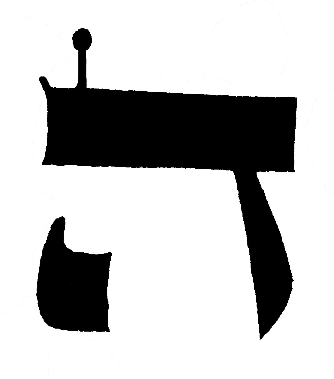

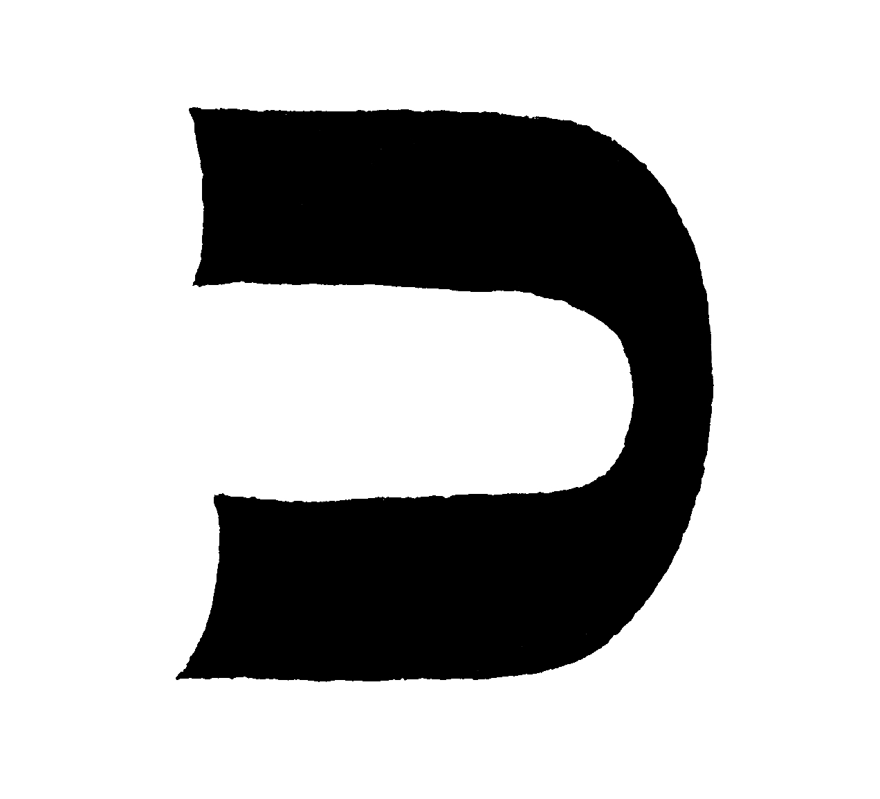
The letter DALET
1. Its roof should be long 2. and its leg short for if its leg is longer than its roof it will be like a final [lit. open] chaf... 3. Initially the leg must be a simple line [inclined] a little to the right. 4. And that it should have a a small tag on the top of its roof on the left side. 5. One must be very careful with the squaring [of the letter] so that it doesn't look like a resh... 6. and initially it is not enough only to rely on a sharp angle behind it, rather also there should be there a good heel because its symbol is two locked letter vavs.
The letter HEH
1. One must make for it at first a small tag above on the left side. 2. And at the back one should be careful initially that it is squared like a dalet and not rounded like a resh. 3. One does not have to make it a heel like with a dalet only that it will be a sharp letter (however the custom is to do this - kol sofrim) 4. And the stroke inside the letter should not be close to the roof, rather there should be a division between them so that an average person can perceive it well from a Sefer Torah...5. ... the stroke should initially be thin above and a bit fatter below like yud [upside down]. 6. and initially it should slant a little at the bottom, to the right side and not to the left lest it resemble a tav. 7. And the length of the stroke should be no less the length of a yud with its underneath prickle...
The letter VAV
1. One must make its head short and no more than the thickness of a quill so that it does not look like a resh. 2. And its leg should be as long as two quill thicknesses so that it doesn't look like a yud but do not make it too long lest it looks like a final nun to a child. 3. And for this reason it is also good that its head is rounded on the right side , so it doesn't resemble a zayin and be invalid. 4. And its face should be straight and not sloping. And its leg should be a simple [line] underneath, not broken in the middle. It is also good that the thickness of the leg should reduce until it sharp at the bottom.
The letter ZAYIN
1. One must be careful that its leg not be long so that it doesn't look like a final nun and be invalid... therefore its leg should be no longer than two quill thicknesses. 2. And its head should pass over on both sides so it doesn't resemble a vav. 3. and it should be squared off, with three taggin on its head. 5. Its leg should be a simple [line] underneath it and not broken. 6. And there are those that make the line underneath thin when it comes out, thickening until midway and then thin it until it becomes sharp at the bottom.
The letter CHET
1. Its two legs should be in the shape of two zayins. 2. And the zayin that is on the right side it is right to make the corner of it head curved on the right side . 3. And the zayins should be apart from each other at most a quill thickness. And they should be joined together with a humps (sort of a high roof) 5. And one makes a staff (like a big tag) for it on the head of the left leg and not in the middle.(This letter is written very differently by the Ari who uses a vav and a zayin, and the sefardim who make the roof one piece without the humps as we are used to seeing a chet in print).
The letter TET
1. The right hand head should be bent a little inwards but not bent a lot 2. and the left head should be like a zayin with three taggin on its head, 3. but the right head should be rounded like a vav. 4. And also at the bottom on the right side should be rounded because its shape is like a kaf and a zayin [combined]...


The letter YUD
1. The length of its body should be one full quill thickness and no more so it doesn't look like a resh. 2. And one should write it straight - ie that its head and its face should be an even line and its face should not tilt upwards. 3. Initially the right side at the top should be rounded. 4. And one should make it a leg from the right side and 5. slant the leg to the left side and the leg should be short and not long so that it does not look like a vav and be invalidated by a child's reading [it wrong]. 6. Also the yud must have a small tag above on its face 7. and opposite this a small prickle coming down from below and the prickle should be shorter than the tag... (Note: whether the absence of this small prickle invalidates the letter is hotly debated and is used as the prime example of how careful one must be in forming the letters).
The letter CHAF
1. One should write it rounded at its back so that it doesn't look like a bet and should [indeed] be rounded at its back on both sides 2. and the space on the inside should no less than a quill thickness. 3. And its face should be equal at the top and bottom. Also one must be careful that one does not shorten its width so that it doesn't look like a nun to a child... if one made it corners at the back above or below it is invalid...
The letter CHAF SOFIT
1. Its leg should be long. 2. and its roof short so that it doesn't resemble a [large] resh. (Nevertheless one should not make its roof too short so it doesn't look like a final nun to a child and it is invalidated)... And the scribe must be very careful that initially the thigh is double the length of the roof so that if he were to bend it it would be able to be a normal chaf (Note: therefore one is discouraged from lengthening the letter at the end of a line) 3. The scribe must also be careful that he doesn't make a corner for the final chaf above rather it should be rounded... and if he made a corner above like a dalet it is invalid...
The letter LAMED
1. Its neck must be as long as a vav 2. and the head of the neck should be rounded on the right side t the top 3. and on the left side a corner for its head like it is the head of a vav 4. for the form of the letter lamed is like a chaf with a vav on top of it and that is the reason the thigh should be rounded at the back on the right side 5. and bent well to the front like the shape of a chaf. However whether one must extend the lower line of the chaf to be equal to the upper line is a matter for dispute. There are authorities who say one must and those who say on the contrary one should only extend it a little.... 6. and on the left side at the place where the chaf and vav join there should be a corner and not a curve.... 7. The join of the vav and chaf should be fine 8. because its form is like the form of a vav where it gets thinner at its end... 9. One should write the head and the neck a little bent to the front 10. and on the head of the neck there should be two taggin, one on the right large and on the left small.
The letter MEM
1. Its shape is a bit like a chaf and a vav [joined side by side] therefore the top on the right side should be rounded. 2. But at the bottom it should have a corner without a heel 3. and its roof should be equal and not rounded (only rounded on the right side) 4. and also its roof should be as long as the base of the letter below... 5. and one should take care to join the nose on the left side to its roof. 6. Initially it should extend almost evenly with the roof except that there be between them on the upper side [a break] like a small notch. 7. and the shape of the nose should be like a vav standing slightly leaning at an angle but not too much. 8. and it should reach until it is opposite the base below and until . and one should be very careful that it [the nose] does not touch it [the base]. 9. but in all cases there shouldn't be between a huge gap initially such that the vav slopes a great deal because of it.
The letter MEM SOFIT
It should initially be rounded at the top on the right side 2. and below it should have a corner on the right and left so that it shouldn't look like a samech... The Pri Megidim wrote that it is better that it be square on all sides because it easier to err (by making it a) samech. And in all cases it should be closed on all sides. 3. And its roof should pass initially outside of the closed part a little like the head of a vav. One should not lengthen the roof to the left too much...


The letter NUN
1. One should make its head like the head of the zayin 2. with three taggin upon it and not wider that the head of a zayin so that it shouldn't resemble a bet if it was a bit too wide. 3. And for this reason one should also make its base below longer to the left side than the head so it shouldn't look like a bet or a chaf. 4. And its neck that is from the center of its head should initially be a bit thick and bit long 5. and lean to the right side so that one can put another letter near its head. 6. and the nun should initially be rounded below on the right side...
The letter NUN SOFIT
1. The description of its form is like a zayin 2. with three taggin on its head. 3. However it must be long that it be possible to make a normal nun if one bent it - ie it must be no less than 4 quill thicknesses with its roof.
The letter SAMECH
1. Its roof above should initially be long (ie that it is of equal height) 2. and below a short base 3. for it must be rounded on three corners - ie above on the right side and below on both sides and it should be completely closed. 4. and it roof above should initially extend outside to the left side for the length of a vav.
The letter AYIN
1. the first [part of the] letter should be like a yud 2. and initially its face should incline a little upwards. 3. and its body should be lengthened below it in its standing a little (for if it is lengthened [too] much at an angle one would not be able to put another letter near the ayin) 4. and in it there should be a zayin standing straight 5. and touching the thigh below its half [way point] 6. and one should make on top of the zayin three taggin...
The letter PEH
1. initially it must have above on the right side a corner on the inside 2. and also outside it should be like a small corner. 3. and it should be at its back so that it be rounded outside 4. and similarly below should be rounded outside and like all the bent letters that must be rounded at the bottom initially but inside it should have a corner so that the white space inside is the form of a bet. 5. and it should be one and a half quill thicknesses wide so that one can suspend inside it the stroke so that it does not touch the body of the letter (and not how some scribes are accustomed to to make a heel outside on its side like this (see right) and say that this is better to make the white bet inside because this is really a broken letter)...
The letter PEH SOFIT
1. One should make it initially with a corner above like the bent [form] has a corner above 2. Also it must be long initially that you would be able to make from it a bent peh if you bent it over. 3. but after the event if the right leg against the place of the point and below was [at least] the full length of a yud then this is enough...


The letter TSADI
1. Its form is like a bent nun 2. and a yud on its roof. 3. The first head that is on the right that is like a yud its face is slanted a little upwards 4. and one should join the leg of the yud with a firm join in the neck of the tsadi and should be very careful to join it in the middle of the neck and not below so that it doesn't look like a ayin. 5. And the second head should be like a zayin extended in both directions for one does not extend the neck from the end of the head... [though the Ari disagrees] 6. and the neck should be a little thick and a little long 7. and lean to the right side in order to place another letter by its head 8. and its base underneath should be lengthened initially on the left side more that the two heads 9. and initially it should be rounded at the bottom on the right side like all the bent [letters]. 10. and [it should have] three taggin on the left head...
The letter TSADI SOFIT
1. Its heads should be like a bent over tsadi and it is also made of a yud 2. and a nun, but a final nun, 3. therefore its body should be like a final nun. The required length is that it descend below from the join of the heads initially such that one is able to make a bent tsadi (from it)...
The letter KUF
1. Its roof should be equal 2. and one must make a small tag on the left side on its face initially. And one should the prickle thin so it does not spoil the form of the kuf, so that it doesn't look like a lamed beacuse of this on one side. In Ma-aseh rokeach [the author] wrote that this is the reason for moving the tag away from the end of the roof. 3. The right thigh must be bent pronouncedly towards the lft leg like a bent chaf, however it must be much shorter than the roof. 4. And the left leg should be suspended in it and this is like a final nun however a bit shorter. 5. Therefore it head should be thick 6. and it should taper below like a final nun. 7. Initially one shouldn't place the (left leg) further away than the thickness of the roof 8. and initially one should draw the suspended left leg sloping a little to the right side... 9. and if the left leg is only as long as a yud (measuring) from the place of the bend and below it is valid after the event...
1. Its roof should be equal initially 2. and one must be very careful that it be definitely rounded at the back in order that it does not look like a dalet and if it appears like a dalet it is invalid... 3. The thigh should be short so that it doesn't look like a final chaf. 4. and its roof should be as long as a bet so that it doesn't look like a vav...
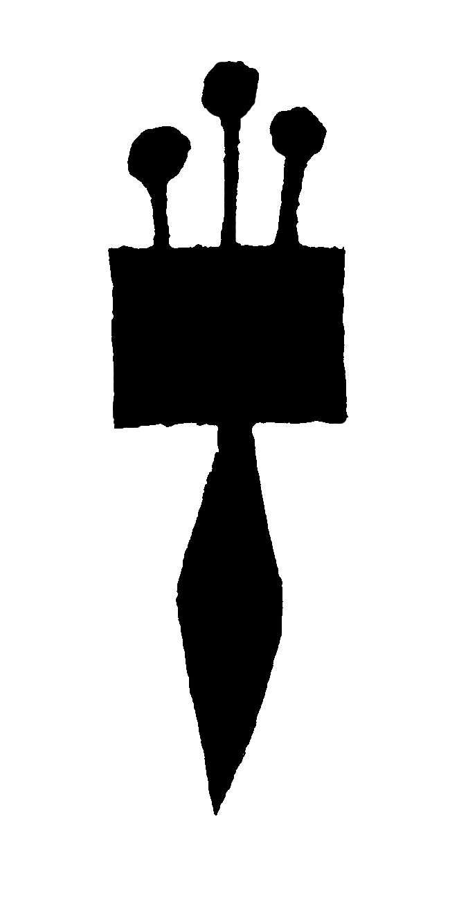
The letter SHIN
shinani for stam plus
1. It has three heads. Its first head with the thigh that is drawn from it is similar to a vav. 2 and its face points upwards slightly. 3. and the second head is similar to a yud and its face also points upwards slightly. 4. and [there should be] a small prickle on it initially. 5. and the third head must be made with the form of a zayin. 6. with three taggin on it... 7. the left head should initially have its thigh standing upright 8 and one should draw the thigh from the first head at an incline downwards until it makes a sharp point. 9. And the thigh of the second head should also be inclined downwards to thhe left side 10. utnil all the heads are joined below in one place... 11. and the base of the shin should not be wide, nor rounded but sharp so that all three heads stand below on one leg like a kuf and resh.
The letter TAV
tav for stam plus
1. It's roof with the right leg should be like a dalet 2. and its left leg like an upside down vav and there are those that make it like a small upside down dalet... 3. and the left leg must reach upwards [to touch the roof] for all the whole letters must be one body. 4. and the right leg should be short, bacause if it were [too] long, perhaps it would appear... like a final peh. 5. and one should draw the leg inside the taf so the end of the left leg corresponds with the end of its roof. 6. The end of the leg should not protude outside so that one is able to put another letter close to it from top to bottom. 7. Also the roof should not protude further than the leg...


